We get a lot of people asking if they should mobilize their web sites these days and I have to say that our answer is a resounding YES! Having your site mobilized is imperative. You need your site to work everywhere your clients are.
More and more of your clients are on smartphones and tablets. In March of 2012 Comscore reported that 106 million people in the U.S. were using smartphones and in June of 2012 eMarketer predicted that the U.S. tablet market would double to nearly 70 million users. This is not a market you can ignore!
When it comes to mobilizing your site you have choices – you can decide to create a .mobi site. This is a stand-alone site that is created just for smartphone users. You can create an app (once again a separate entity). Or you can create your site using responsive design.
ribit creates their sites using responsive design for several reasons. First and foremost you only have one site to maintain. If you decide to develop a .mobi site or an app, when you make changes to your main web site you will also need to make changes to the .mobil site / app for consistency. We find it is much simpler to have one database to deal with, and the ability to keep the integrity of the design. Yes it can be technically challenging, but that is what makes life fun!
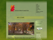
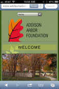
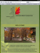
But can you make the site have a responsive design, have cool features and be visually appealing? Of course you can. I have three very different examples. First Addison Arbor Foundation. They came to us needing a site with a calendar, eCommerce and a blog that would highlight their mission to promote and enhance a sustainable, natural environment in Addison. The site need to look equally as good on desktops, smartphones and tablets. We designed a responsive site using WordPress.
[divider]
As you can see the site looks the same (yet different). While the interface changes to accommodate the mobile environment, the design is not lost and all their features (calendar, etc.) still function perfectly.
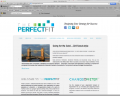
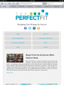
My second example is The PerfectFit. They wanted a visually clean site, easy to navigate and they wanted to highlight their blog – hence the blog slider on the home page. Now you might think it would be difficult to make that feature translate to mobile, with a little finesse we were able to implement the blog slider on all platforms!
[divider]
There are more differences between the visual “look” of The PerfectFit layouts on desktop vs. smartphone vs. tablet than on some of our other designs. ribit decided to make the navigation completely accessible on the tablet version while still highlighting the blog slider on the tablet version rather than use a drop down. This functionality is easy for the user (touch vs. drop down) while still visually appealing.
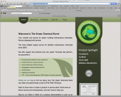
The final example is The Green Chemical Store who came to us wanting to have a site that highlights their products in a catalog, allows you to easily contact them with questions about their industry and of course, have a blog. The final result works on both the desktop and on mobile devices.
Web Site
[divider]



One Comment
Leave a reply →