 ribit took our cue from Apple and Jonathan Ive and their new iOS 7 design. We have moved away from using a skeuomorphic design to one that simply reflects ribit’s desire to make the web easy to use and beautiful. It is all about simplicity, starting with our redesigned logo. She is still a frog, and yes she is still a girl frog, just in a simpler form.
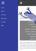
 And our new site, as you can see, is cleaner, faster, easier to navigate and yes – responsive! Our mobile site is very clean, and looks almost identical to our desktop version. It is quick to load (yes Google, we heard you talk about load times) and we worked hard to make sure that everything was optimized.
 In keeping with our new theme of simplicity we utilized off-canvas navigation on the mobile version of our site. We thought this was a bit more interesting than the traditional menus and we also get a bit more creative with our site. Now we can give our clients choices!
The other thing we implemented with this site was making the social media icons a bit more prominent. We hope this means that you will share our posts more. Now that our new site is up I plan on blogging a bit more, so come back often.
Wander through the site, check it out on your smartphone and let us know what you think!
4 Comments
Leave a reply →